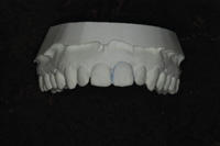
“No Pain, No Gain!” the headline bellows. If the clichéd message in this ad were plugging a local gym or fitness center, we certainly wouldn’t think ill of it, as it seems a perfectly appropriate appeal from a muscle-manufacturing venue. But when that same headline is used to lure the reader to—of all places—an orthodontic practice, it takes on quite a different aura.
Looking at the positive side, despite the fact that the headline has become trite in many circles, it’s still an attention-getter—and isn’t that supposed to be the paramount purpose of a headline? While the answer is yes, we cannot ignore the not-so-positive side of the message, which is that the reader doesn’t necessarily come away with a favorable impression of the doctor or practice. But to be fair, we can probably assert that under the right circumstances, some prospective patients might possibly be drawn to such creative posturing. Under most circumstances, however, the ad would likely keep out more patients than it would bring in. Considering the ambiguity here, is it any wonder why bad ads are happening to good practices?
Although there are no hard and fast rules for ad suitability in the marketing of a dental practice, what follows are several precepts that I’ve developed over the years for generating professional and prudent, yet engaging ads.
 Above All, Do No Harm
If the no pain-no gain headline were put to the test with this precept, it would fail miserably because it runs such a high risk of turning patients off. The very last notion you’d ever want to suggest to a prospective patient is that coming to your practice is going to hurt. Even though you’d be dressing it up by alluding to a nicer smile or improved dental health, the core of the claim is still pain…not a suggestion that sells particularly well. Yet, I’ve seen this headline used by more than one practice. What are those doctors thinking?
With respect to ad copy, doing no harm refers not to your patients, but to your practice. In other words, above all, don’t put your stamp of approval on an ad that might in any way sabotage a patient’s view of your credibility, credentials, professionalism, expertise, or experience. Remember, however, that a bad headline isn’t the only source of potential damage an ad can do to your image. Consider the fallout from misspelled words, like these that I’ve found in dental practice ads in various publications: foot (root) canals, tooth clearing (cleaning), or first phase brakes (bra-ces). Forewarned is forearmed, doctor; such typos will do nothing to further your practice and just may cause it some harm, so take your proofing seriously. But ad jeopardy doesn’t end there. Just imagine the ad inadvertently running without your phone num-ber on it. Or even more disconcerting, if it were to run with the wrong phone number. At best, you’d be seen as sloppy. At worst…well, let’s not even go there.
While copy—the text of your ad—is by far the most threatening factor, it is by no means the sole repository of risk. Think about the visual effect of a pen-and-ink drawing that’s supposed to look like a contemporary profile of a face, but in actuality looks more like the profile of a woman with rather pronounced muscle definition—pectoralis major, that is. A pretty picture to some, but an entirely inappropriate icon for your practice.
There’s also the visual impact of a photograph. Picture this: Dr. Dog Lover in a candid shot at home, flanked by his two pit bulls. Again, what’s this doctor thinking? After running the ad for several months in a local newspaper, he must have gotten enough negative feedback to pull the ad. The rule of thumb here is that any photo or illustration you use needs to be a visual aid. If it’s not going to help the ad or the practice, you definitely don’t want to use it.
WHAT MAKES A GOOD PRACTICE AD?
First of all, make sure you are in compliance with your state’s ad-vertising regulations, then consider the following components when constructing an ad:
(1) A clever headline that promises the reader a benefit or contains news. Five times as many people read the headline than those who read body copy, so make it irresistible.
(2) An interesting visual, either graphic, illustration, or photo. Some headlines can stand alone with no visual needed. For example: Nothing Lights Up a Room Like a Beautiful Smile.
(3) A subhead that kindles the reader’s interest and eagerness for more information.
(4) Body copy that leads readers to the precise action you want them to take.
(5) Design or copy should never overpower your message. Make sure your ad’s copy and graphic elements are clean, well-designed, and orderly, leaving plenty of white space (breathing room).
(6) Practice logo and tagline.
(7) Location (ie, corner of 5th and Main) followed by complete address.
(8) Contact information—phone number, Web site, e-mail address.
WHAT MAKES A GOOD AD GREAT?
Use humor, surprise, desire, or fear to involve the reader instantly. Some dentists have gotten rave reviews on ads showing a photo of a gopher next to a photo of a beautiful smile. The trick here is to know your target market.
MAKING YOUR TYPE READER-FRIENDLY
Good typography will help your reader grasp what you’re trying to say. Bad typography can foil the chance of your reader getting your message. Here are some guidelines to keep bad typography at bay and avoid making your ad one of those bad ones that happens to good practices:
- All caps can impede reading. Save the all-caps mode for small areas of copy, like headlines. The same goes for all italics.
- Don’t confuse your reader with too many different fonts.
- Don’t put a period at the end of a headline. It’s like a full stop that will obstruct your reader from going further. A question mark where applicable, on the other hand, encourages the reader to go on to find the answer.
- Serif typefaces, like Times New Roman, are generally easier to read than sans-serif typefaces, like Gill Sans. The serifs help the eye distinguish the shape of the letter.
- Use bold face or italic for key words or ideas.
- For long body copy, use a drop cap on the first word of the first paragraph to increase interest and readership.
- Another option for long body copy is the use of 2 or more columns.
Increase readership with the use of leading (line spacing) between paragraphs. It gives the eye a much-needed break and makes copy less tedious to read.
- Reverse type—white type on a black background—is far more difficult to read than black type on a white background. Use it in moderation, if at all.
- Make sure that the type size you use is not too big or too small.
Remember that you want to make it as easy as possible for your reader to read and be motivated by your intended message. Prospective patients can’t be influenced by ads they don’t notice. Worse yet, ads they find confusing or boring will leave them with a poor impression of you. No pain, no gain doesn’t work here either.
WHO ARE YOU TRYING TO REACH? WHERE WILL YOU FIND THEM?
Deciding where to place your ad has probably not been a slam dunk for you any more than it is for most doctors. There are so many seemingly good choices out there, and advertising space sales reps can be very convincing. What follows is my take on which venues are best for your print ad. The pecking order is most cost-effective to least cost-effective, based on my experience with dental practices across the country.
If you’re interested in attracting the well-educated, well-connected, or well-heeled, you may find that city and regional magazines give you the most punch for your advertising dollars. Almost 75% of Chicago Magazine readers, for example, are college graduates, and more than 70% of the same readership is employed in a professional/managerial capacity. Boston Magazine profiles its readers’ mean household income as $185,000 and mean net worth as $856,000. It’s clear that your ad in this magazine—or its sister publications from coast to coast—will reach the crème de la crème, an audience of affluent readers who have the discretionary income to enjoy the best of your dental services.
City and regional magazines offer additional perks. Seventy-seven percent of Phoenix Magazine readers spend 30 to 90 minutes with each issue, and the bonus is that each issue gets to an average of 5 readers per household or subscriber address. D Mag-azine in Texas’s Dallas/Ft Worth area goes to 250,000 readers. One can’t dismiss the advantage of having countless ad-ditional copies of these publications available for browsing at hair salons, real estate offices, hotels, spas, restaurants, and the waiting rooms of medical practices and hospitals. All told, that’s very valuable exposure.
Turning for a moment to newspaper advertising, there is a distinct advantage to having widespread exposure as often as you’d like. But a word to the wise: if you’re going to commit to sizeable sums for newspaper advertising, you owe it to yourself to submit an ad that will serve you well. This, of course, goes for any dental practice ad in any publication, but the reason I bring it up is that most dental practice ads in newspapers are duds. By that I mean they are ads that do nothing to further practice goals. One such ad is the big business card. No headline, no call to action, just a business card that’s enlarged to whatever ad size the doctor has chosen. Most readers’ reactions? “So what!” That’s what I call a dud with a thud.
Another ad that will not serve you well—and is often run in newspapers—offers a free exam or a discounted hygiene visit. Believe me, that’s a really bad ad for a couple of reasons. First of all, if it appears that you’re giving away professional services, how valuable can those services possibly be? Next, the freebie will frequently set off a misleading swarm of activity. Phones will ring off the hook, the office will be abuzz with commotion. While appointments aplenty will be put on the books, patients of record will be put off because the wait for an appointment is too far out. There will be talk about adding an associate or more hygiene days, but when the whirlwind dies down, the additional professional time will be superfluous. The final blow will soon be apparent: instead of returning to the practice when these coupon patients need dental services in the future, they’ll scan the newspapers again for the best deals in town.
The next most cost-effective venue, believe it or not, is the newsletter of a local community association, ie, the Ki-wanis, PTA, church/synagogue, sports league, or even the Red Hat Society. These newsletters are often enthusiastically read or at least skimmed through by many members of the organization. One idea that works particularly well in such a venue is a message of congratulations or condolence to a member of the organization from you and your dental team. Besides recognizing the individual with a fitting tribute, the ad shows that you really know and care about your patients. It’s a 1-2 punch that gives you the edge.
With what I’m about to say, I’m not putting the ki-bosh on advertising in the Yellow Pages. In fact, I have to admit that many clients report that such advertising has been very good for their practices. But I’d be remiss if I didn’t share both the upside and downside of this particular advertising venue. If Yellow Pages ads are well-tracked by the practice—as all ads should be—doctors will know that these ads yield x number of patients a year, and in some cases those numbers can be considerable. Doctors and office managers, however, don’t necessarily know the value of those patients. Under closer scrutiny, they find that some of the patients who’ve had to resort to looking in the Yellow Pages for a dentist—because they may live in a setting in which nobody goes to the dentist—end up being one-timers. They’re in pain now and need someone to do a quick fix right away. Typically, these patients will opt to have a tooth extracted rather than trying to save it. Never having had a regular dentist, they’re not looking for one now. Routine dental care and maintenance are just not part of their mindset. With such a low dental IQ, the value these patients bring to the practice is nil.
Although I will not categorically state that Yellow Pages advertising does not provide a good return on investment, I’d certainly urge you to weigh carefully the costs against the revenues generated.
THE FATAL 8 POINTS TO KEEP IN MIND
(1) Don’t ever use an awful headline like “Are You a Dental Chicken?” or “We Cater to Cowards.” If you’re really sold on that concept, use something that’s not so demeaning, like “Afraid of Going to the Dentist?”
(2) Don’t ever consider using the old smiley tooth icon. It has been laid to rest, as has the animated toothbrush. Yours is a professional practice, and although hu-mor may be used to give life to an ad, corny symbols of dentistry will never be up to the task.
(3) Don’t ever let the headline repeat what’s in the visual (graphic, illustration, or photo). The two must tell the story together, but in different ways.
(4) Don’t ever allow your creative team to mistake a bright idea for the right idea.
(5) Don’t ever forget that when an ad using logic and an ad using emotion are put head to head, emotion will win out, hands down.
(6) Don’t ever be caught short. Always have a current ad on hand—either a camera-ready slick or an electron-ic file—for those times when you get approached by your child’s teacher on Friday for an ad journal going to print on Monday.
(7) Don’t ever allow a publication to do your ad layout and design. It’s true that you get what you pay for.
(8) Don’t ever let your patient write your ad. That can be as big a mistake as your patient extracting your tooth. With a wave of his or her magic wand, a good copywriter can make the difference between an awful ad and awesome one. Isn’t that worth the price of admission?
ONE LAST THOUGHT
Advertising should be viewed as an investment, not an expense. As such, it must ultimately generate more than it costs. The truth is this: you can probably afford not to advertise. But you surely cannot afford not to advertise wisely. Keep in mind, therefore, that the wise man lowers a ladder before he jumps into the pit.
Ms. Weinstein is president of Communication Finesse, a dental practice marketing communications firm specializing in practice brochures, ads, and identity packages. She can be reached at (623) 214-5008 or comfinesse@aol.com.
 Above All, Do No Harm


